It seems that every week or two as we gather around the virtual water cooler (i.e. Skype), we find ourselves discussing a familiar conundrum—is it time to make the leap into the ‘handheld’ museum experience? In our world of software development, it’s a pretty big deal.
When I first began working with EDM in the fall of 2011, Darran Edmundson brought me to Australia to observe an installation of EDM’s flagship software program firsthand. At the Museum of Australian Democracy (MoAD), 75,000 students use this MUSE-award winning program each year. Dubbed ‘Trail’ for it’s breadcrumb-like progression, the screen based RFID system was carefully designed to bounce visitors away from screens and towards the museum’s rich material culture. While the underlying software architecture and algorithms for ‘directing traffic’ are incredibly complex, the hardware and visitor-facing interface is relatively ‘lo-fi’ and visceral.

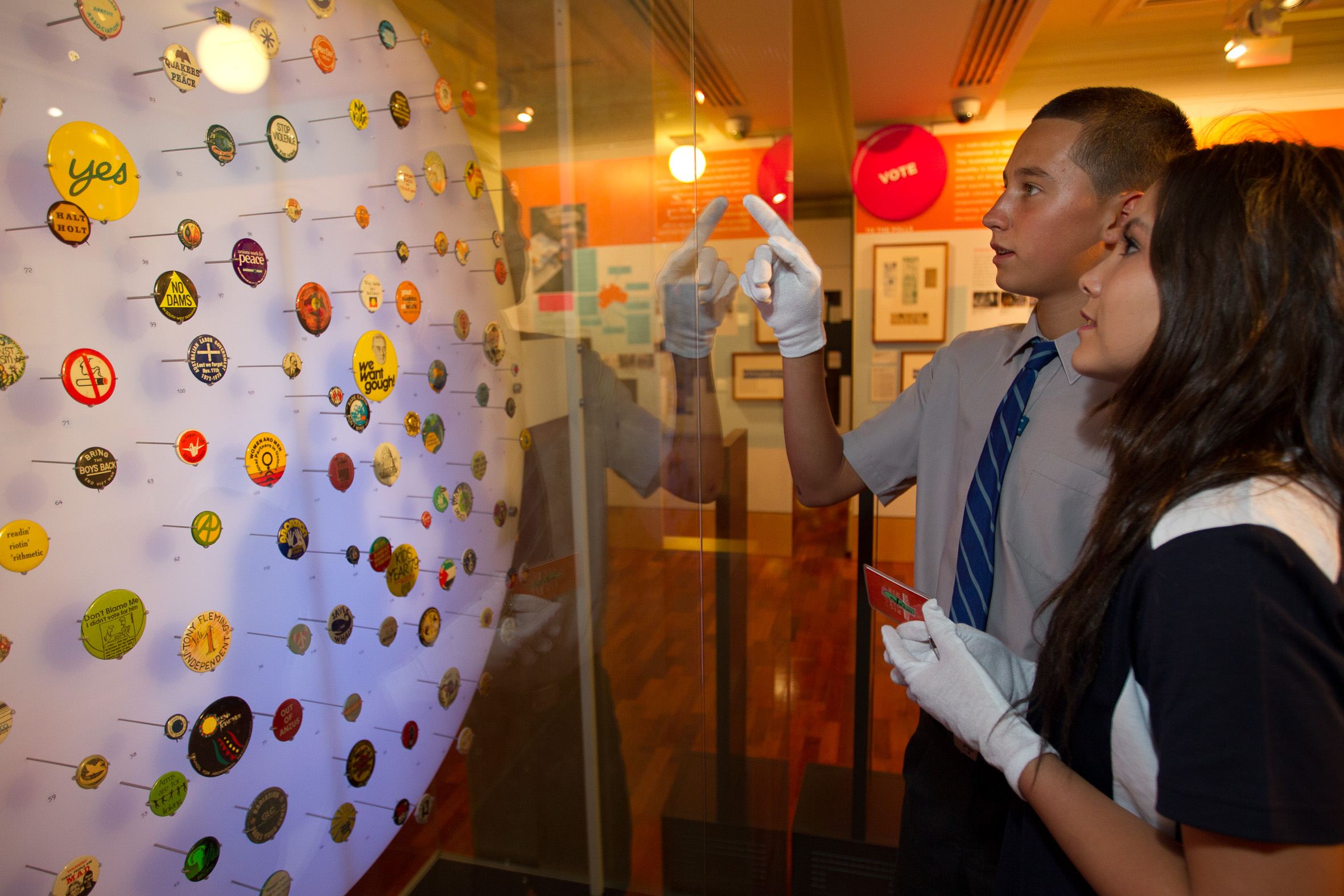
On this day, a full house was expected—with a class of 30 kids pulsing through every half hour. To say I was skeptical as to how it would unfold would be an understatement. But after spending the morning on the floor watching group after group of kids independently navigating their way through the museum’s exhibits—keenly discussing graphic panels on suffrage or closely eyeing a 19th century ballot box beneath a glass vitrine, I was gobsmacked. It worked. Probably our most technology-savvy audience was not only engaged, but I don’t think they missed their phones at all.
Trail is a screen based RFID system that was carefully designed to bounce visitors away from screens and towards the museum’s material culture.
More than anything, EDM is driven by the desire to connect people—to an exhibit, to an artifact, to other visitors. But despite our love of technology (and our phones), we have yet to encounter a way to integrate mobile devices into the museum experience that isn’t somehow at odds with the ‘real-world’.
There are, of course, a myriad of technical issues with mobile museum apps, mostly related to bluetooth/wifi-based position tracking. Presumably these will be more or less solved in the next few years. But there’s a more fundamental problem. If you watch visitors using a mobile app in an exhibit space, many will walk through an entire gallery, head down, with eyes firmly glued to that tiny glowing smart-phone screen. It’s the “heads-down” thing that bothers me the most because it quite literally says “I am not aware of the space around me.”
We all agree that there must be a way for mobile technology to augment the museum experience in a significant way—in fact, mobile’s potential to deliver a magical experience is the carrot that keeps bringing us back to the conversation. But we still believe in the museum as a very real public space within the community, full of art and artifacts and other people. And for now at least, we’d prefer to foster those connections by looking up and around, not down.

Care to share your thoughts? Please contact us using the form below or send us an email.
No Fields Found.